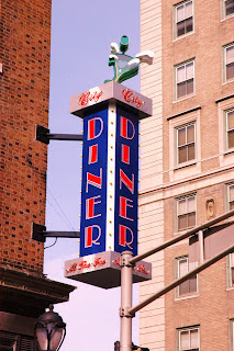
Big, artistic signs say BIG CITY; they let you know that the place/brand is important and noteworthy. The Covenant Blu/Grand Center neighborhood has done a great job with exciting signs both old and new. Look no further than the Big Brothers/Big Sisters sign that wraps around the recently renovated building at Grand and Lindell. Then you've got the Fabulous Fox Theatre and many others in the area. See what I mean:
photo source (Count On Downtown)
City Diner jumped in with a fantastic new addition to a prominent corner of the neighborhood:Notice how the neon lettering says "City Diner At The Fox"? That means permanency and investment to me. It means the Fox is here to stay and is a landmark, and City Diner is putting their hard earned money up to be part of the city and its surroundings.
With KDHX and KWMU moving to Grand Center, why not put up some awesome signage there as well? Heck, KDHX's new building even has the framework already in place on the rooftop. Check out this photo-shopped vision of what could be:
It's simple: Big city = big signs.
We have lost some really prominent signs over the years, the most recent being the Globe Democrat sign on North Tucker.
St. Louis was once home the Globe-Democrat Newspaper which was in existence from 1852-1986. It began operations on July 1, 1852 as the Missouri Democrat, which later merged with the St. Louis Globe. It was St. Louis' conservative daily newspaper for much of its long run. Political commentator, syndicated columnist, author, politician, speechwriter, and broadcaster Pat Buchanan launched his career at the Globe-Democrat in 1961 (at the age of 23) as an editor.St. Louis was once a great, influential city and the Globe was part of the city for over 130 years. It was built to last and the sign they put on their most recent building on North Tucker Boulevard was bold as well.
I witnessed the sign being dismantled and hauled away recently.
Another great sign gone, another great part of our history erased.
New signs are needed to make bold streetscapes that people recognize and identify with. They bring vibrancy and train the eye upward to the amazing architectural details our forefathers graced their buildings with.
I would like to see our city's myriad of ghost signs get repainted to their original splendor too. (I would like to start up a business and do this if anyone wants to partner and research if there's a market) I'd also like to see more businesses with cool signage. Now I realize these are not cheap, and with the huge amount of turnover of small businesses, I can see why a new business like Big Shark or Left Bank Books entering a new market Downtown would not want to invest in a sign before they get a good understanding of the business they will do in their new locations. However, if they are making a profit and plan on being part of the city, let's see some eye-catching big signs to mark their territory and get people's attention. Be part of the neighborhood and the street scene!
St. Louis needs more artists painting signs on buildings. St. Louis needs to make it as easy as possible for business owners to erect huge, attention-getting, artistic signs.
We deserve it.


the photographer at Kingshighway and Christy put up a great neon sign recently...forgot his name off hand, but worth checking out.
ReplyDeletethe photographer at Kingshighway and Christy put up a great sign recently...worth checking out.
ReplyDeleteAgreed 100%!! STL used to have all kinds of great signs in every commercial and entertainment district until the city imposed very stifling sign ordinances to reduce "visual clutter" and the threat of pedestrians being hurt by falling abandoned signs. The sign ordinance has been revised, and there are ways to get cool ones installed again. They do, however, tend to be expensive without the help of the city's Facade Improvement Program, and many business owners opt instead for the generic window vinyls or uniform awnings that don't adequately reflect the personality or originality of the establishment. Excellent post!
ReplyDelete